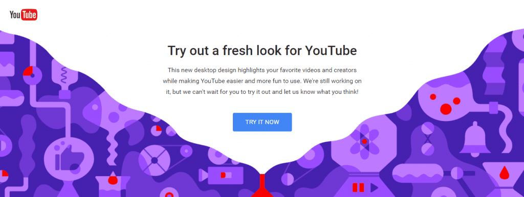
Anyone who wants to try the new Youtube interface can already do it and even give feedback to the tech giant Google. According to the tech giant Google itself, this is a lighter and simpler interface, which offers a better user experience.
Simple design
The new computer experience includes a simplified design. Navigation is easier and allows content, channels, and creators to shine.
Dark mode
Reduce the brightness of the screen, avoid reflections, and enjoy the true color of videos.
Better construction / faster videos
Totally new website design and designed in a faster structure. This means you can surf and watch videos more faster.
How do I enable the new YouTube interface?
If you want to try out the new YouTube interface, simply go to the link “youtube.com/new” and then click “Try It Now”. According to what we tested, this is undoubtedly a much more fluid and elegant interface. In case you want to go back to the classic version, simply click on your profile photo in the upper right corner and choose the Restore Classic Youtube option. So, what do you think about this new design? Simply share your views and thoughts in the comment section below.
Δ


